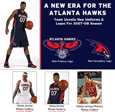
Braves New World - The Hawks New Uniform

The Hawks unveiled their new uniforms / logo today. My initial reaction? Bland. My follow up reaction? I like 'em. I really like 'em. Apparently the away jersey is an homage to the 1958 St. Louis Hawks, winners of the NBA championship.
Gone is the yellow accent, gone is the black, remaining is the red, white and blue. Wait a minute, blue? The uniforms are very reminiscent of the Atlanta Braves' American color scheme- professional, understated, easy to get behind. Nothing about them pops, or takes any risks (except for maybe the silver piping on the away jersey). They look... nice. Nobody is going to think these are their favorite jerseys, but nobody is going to think they are the league's ugliest jerseys, either.
This franchise is slowly but surely moving towards respectability. Despite the many horrible mistakes Billy Knight has made and will certainly make this week, the one thing he hasn't done is cripple the franchise. There is still plenty of cap room, which you can bet will be used to sign Josh 2 (and maybe Josh 1) to contracts that pay them what they are worth. Josh 2 is the face of this franchise. He is the highlight factory. He's local. Fans love him. I have no stats to back this up, but his Sportscenter Highlight to game ratio is nearly twice that of the nearest Hawks' player. This team isn't about to win a championship, so there is no need to splurge on an overpaid veteran (cough cough Vince Carter cough). Knight has systematically dropped every player that was being paid too much (cough cough Al Harrington) for cheaper guys that, although they might not be as good, are a far better value. One could argue that all 3 of our point guards are overpaid, since we've invested a combined 12 million in a group of guys that still can't run the point as well as Josh 1, but that was about as much of a risk that Knight has taken. This franchise will be well positioned to make some moves when the ownership situation is handled, and these uniforms go nicely with the high value of the roster.
Although a silver alternate road jersey would be pretty sweet.

3 Comments:
I like it. Not too simple as there is some creativity on the side of the uniform but not overly graphic like in the late 90's when they had the logo soaring across the chest.
I would've liked to have seen a new logo since they've had this version of the Hawk since 1995. Yes, I realize that the color scheme is different as well as the font but a whole new, creative logo would've been neat. It seems as though most NBA teams aren't changing the logo but rather the color scheme. You had the Bucks last year, the Jazz a couple years ago and the Nuggets before that.
It's expensive to change a logo, I guess. The league charges a fee (I suppose since it affects every other team, too).
I really like the new uniforms, too. I'm especially glad they're getting rid of the horrid yellow alternate jerseys. I wasn't sure what to think of the color scheme at first, but I'm getting used to it.
I think these uniforms would have been a lot better if they kept the red/gold color scheme.
Post a Comment
<< Home